We use doors every day and the way they are designed is a huge effect on us. At some point, we have grabbed a door handle and quickly jerked it towards us as we move forward only to be met with embarrassment and feeling like a slight idiot. However, I’m in the belief that no one should feel like an idiot when grabbing the door incorrectly other than the designer.
When a door has a handle, especially a vertical one, it is the user’s instinct to grab it and pull. A “push” sign can help but usually this is not read until after the user has incorrectly interacted with the door and confused as to why the door isn’t working.

On example of this is the entrance door at Museum of Chinese in America (MOCA). It’s has long vertical handles on a glass door on the right side when entering and the left side when exiting. This is actually a good example of a good interaction and a bad interaction. When entering, the bronze handle is easy to see, allows people of different heights to grab the handle to pull the door towards them, and because the door is glass, it allows easy visibility to whether someone is coming out.
However, on exiting, the same door is used but gives a different feeling. It has the same benefits about being long for different heights and easy to see. This time instead of being able to pull, the user has to push. The problem is the handle indicates a pulling motion. The user wants to pull it and may just do that a couple times before realizing that they have to push. It’s interesting how such a small interaction can evoke feelings of embarrassment and awkwardness.
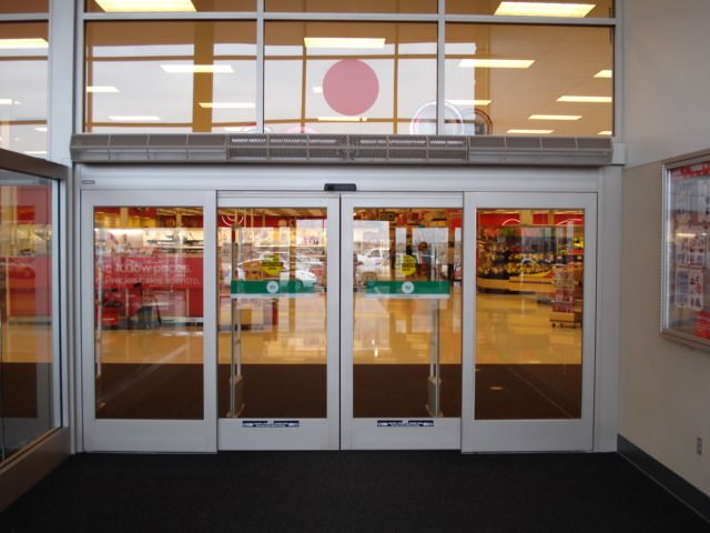
In contrast, there are a few examples of a well designed doors. One being a motion sensor door. For a place like retail store, a motion sensor makes a lot of sense because it allows people easily to come in and carry out the items they may have bought. It is especially nice for stores that have carts because the customer does not have to deal with opening the door and then dragging their cart out.

However, this is not necessarily the overall right solution. A general solution that can work is a hand plate with a sign that says “push” on one side and a handle with the a sign that says “pull” on the other. 
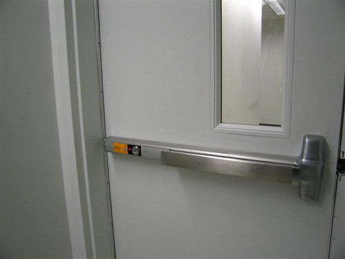
Another great solution is a horizontal push bar that requires the user to push on the bar which then pushes the door. This is a great solution for a door that needs to be securely closed.
 Overall, I think by the awkwardness of a bad door interaction can be helped by remembering it’s not you, it’s the door.
