Real Solutions – Other Project Inspirations

Abolition

Abolition – Prenez position from Marcel on Vimeo.

The Problem: Lack of awareness and feeling of lack ability to do anything about the death penalty.

The Solution: Abolition is a installation done at France’s National Library using two large screens and QR code.  The screens are placed on the opposite ends of the hallway. As the user walks through, they stand


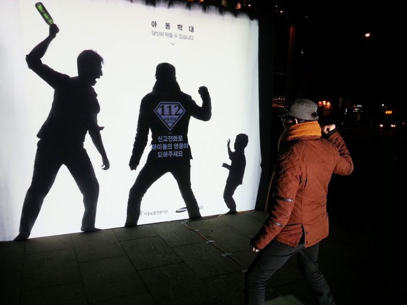
Seoul PSA – Child Abuse

south-korea-child-abuse-prevention-psa-shadow-silhouette-2

The Problem: Child Abuse and people feeling they can’t interfere.

The Solution: A PSA was created using screen and shadows.  On the white screen is a print of the shadows of a person abusing a child.  As the user steps up, a light shines on to them showing their shadow intervening between the two.  At the same time, a superman logo appears with the number 112 and the message “Report (call) to become a hero for children.”


Volkswagen – The Human Crossing

The Problem: Encourage drivers to stop at crosswalks/zebra lanes and decrease accidents related.

The Solution: The Human Crossing is a projected created by Volkswagen that uses RFID chips in pins that are given to children in the neighborhood that are then connected to billboards that display the child’s name as they cross the street. The mission was to make the interaction more personal to the driver.


Looking for You:

#LookingForYou from #LookingForYou on Vimeo.

The Problem:  Encourage adoption of a rescue dog.

The Solution: Looking For You is a screened based installation that creates the experience of a dog following users through a shopping mall.  The user is first given a pamphlet with a paper-thin RFID.  As the user walks through the mall, the screens around the mall start to change and creates a visual of a dog following the person.

ASSS: Bring The Billboard To Life

The Problem: Instill the idea that every person has the ability to save a life.

The Solution:  Bring The Billboard To Life is an interactive billboard that lets people “resuscitate” a person. As the user presses on the patients chest, a connected heart monitor begins to beat to indicate that the patient saved the patients life.

Street Pong

STREETPONG from HAWK Hildesheim on Vimeo.

The Problem:   Preventing stress that comes with waiting and preventing crossing when the light is red.

The Solution: ActiWalk is a game and interface created by Urban Invention. While the pedestrians are waiting on the sidewalk, they can play pong with their counterpart across the street.  At the same time, the color begins to drain out of the screen to indicate the amount of time left before the light changes.
 

Shadow WiFi

The Problem:  Skin cancer is a leading cancer that is commonly overlooked and prevention is usually ignored.

The Solution: Shadow WiFi is a large structure that provides shade for beachgoers. It encourages them to sit behind it by providing  free wifi only in the shaded areas. As the sun moves, so does the wifi single.  In addition to this, the participants were required to sign up for email updates about sun prevention.

The Impact: According to this article, the Shadow Wi-Fi was very successful when originally launched in Peru and has lead to future installation plans in San Francisco and New Zealand with the intention of becoming global.   Also, the developers have released the software for non-profit use.

Behavioral Levers:   This is successful in it’s simplicity.  The Shadow WiFi easily provides shade for the user without having to bring their own in a place that normally would be shade free.  It’s also easy to understand and to use. The only requirement is signing up for emails and to sit in a darker area. Although, the average beachgoer is probably going to the beach to get a tan, it’s intention appears to be just to lessen the amount of time they are in the sun and not to eliminate it.  Thus, this does a good job of that.

The Shadow WiFi appears to meet 4 out of the 5 levers of behavior change by Unilever. Those being that it is understandable and easy by just requiring an email sign up and stand/sit in shade, desirable and rewarding by giving free wifi which is a desirable service and rewarding in being free.  The one it may miss on is making it a habit. The Shadow WiFi does bring awareness to the issue and create a one-time solution, but it doesn’t necessarily create a habit. With that said, it is still a creative, “carrot”-type solution that helps to encourage skin cancer prevention without shaming the consumer.

Urban Imagination

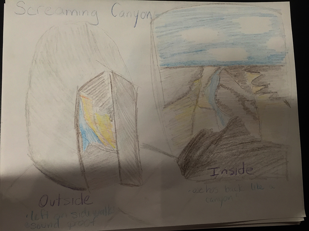
Screaming Canyon

Last week was not the best week for me and I just wanted to scream to get some stress relief.  This feeling inspired me for this project.  Enter the Screaming Canyon.

img_4696

Being able to yell as loud as you want and not think someone is killing you or that you are crazy is a luxury in a city so large.  The Screaming Canyon would be small rooms placed on the street to allow people to scream out their frustrations in a peaceful manner.

On the outside the the room would look like a large stone or rock with door.  When you walk in you are transported into a open canyon.  As you yell out, the canyon echoes back just like in nature.  The canyon is completely private and soundproof so anything can be said.  Not only can shouting or crying your frustrations out encourage peace in your life but also being surrounded by nature can help.  Image result for grand canyon cliff

Interaction Design Studio: Review 2

Terms

Color:  Color is used as an aid to make designs more interesting and dynamic. This can be done by using a few colors at once (with the caution of only a few), combining colors through analogous, complementary, triadic, quadratic or natural combinations, saturating colors to focus attention, and creating a mood through the cultural symbolism of a color.

Highlighting:  Highlighting is a way to bring attention to an area of text or within an image.  This can be done through the typeface, bolding, italicizing, underlining, use of color, inversing elements, and/or blinking.  Highlighting should be used sparingly otherwise, the affect looses power.


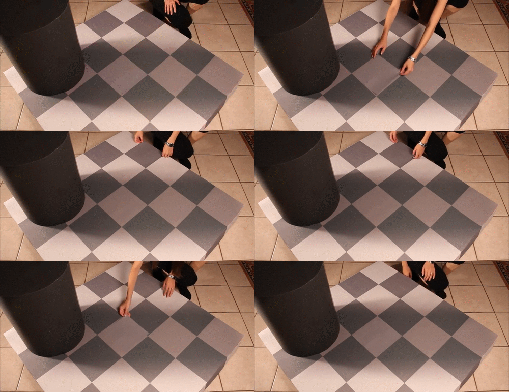
Constancy:  Constancy is tendency to view objects as unchanged despite changes in sensory input.  This includes size, brightness, shape and loudness. Constancy is useful for the brain because it eliminates the constant reinterpretation of a set of objects when seen in different conditions.

9655375

Orientation Sensitivity: Orientation Sensitivity is the visual processing of line orientations that is more quickly and easily understood than other line orientations.   The minimum recommended difference in line orientation is 30 degrees due to it requiring the less effort to detect.  Orientation Sensitivity is based on the oblique effect and the pop-out effect. The oblique effect is the ability to see and judge line orientations that are closer to vertical and horizontal orientations.  The pop-out effect is the tendency for elements in different orientations than the rest to pop-out as figure elements and can be easily pinpointed.

Image result for orientation sensitivity

Cognitive Dissonance:  Cognitive dissonance is when a person’s attitudes, thoughts, and beliefs conflict and create a mental discomfort. People will reduce dissonance by reducing the importance of dissonant cognitions, adding consonant cognitions, or removing or changing dissonant cognitions.  Cognitive dissonance also involved incentives.  A small incentive will likely increase a person to change their beliefs more so than a large incentive.  Cognitive dissonance can be used in successful designs and advertisements to persuade people by challenging their initial believes by encouraging them to invest their time, attention, and participation and then giving a simple way to reduce the dissonance such as buying the product.

Connection of Terms

Each of these terms seems to be connected to cognitive dissonance.  Starting with color, it can be used to create conflicting thought by not using the correct color symbolism for the style.  This can also be done by highlighting incorrect areas or too much.  Also, when the truth of constancy is pointed out, it can create dissonance for a person because it’s different than what they initially believed.  Finally, orientation sensitivity is connected to constancy and cognitive dissonance.  All of these are associated with optical illusions which can cause dissonance.